When Squid Game exploded onto the global stage in 2021, it wasn’t just the gripping plot or social commentary that stuck in viewers’ minds—it was the visuals. The green tracksuits. The pink jumpsuits. The ominous circle-triangle-square symbols. The minimalist card in a simple kraft envelope.
These weren’t just costume or set choices—they were intentional design decisions that operated like iconic packaging.
And whether you’re a small business selling custom coffee or tea labels or a global brand looking to reimagine your identity, Squid Game offers surprisingly powerful lessons about how visual identity—especially packaging—can burn into memory and become a cultural phenomenon.
Let’s unpack what this viral sensation can teach us about how to design packaging that isn’t just noticed… but remembered.
1. Visual Consistency Is Non-Negotiable
Every visual element in Squid Game is painstakingly consistent—from the players’ numbered uniforms to the bright, blocky maze of pastel staircases. Even the props, like the folded invitation card or geometric masks, reinforce the same aesthetic language.
This is the exact principle behind iconic packaging.
Modern Branding Takeaway:
Your packaging—from your label typography to your box closure—should speak one visual language. If your logo is sleek and minimalist, but your product label is ornate and playful, it causes dissonance. When everything feels unified, it builds brand trust and aesthetic recognition instantly.
�� Tip:
Create a visual system for your packaging: color palette, iconography, layout logic, and label hierarchy—especially for categories like custom lotion labels or custom soap labels, where customers compare many products side-by-side. Strong consistency gives you a visual edge.
2. Symbols Are Stickier Than Text
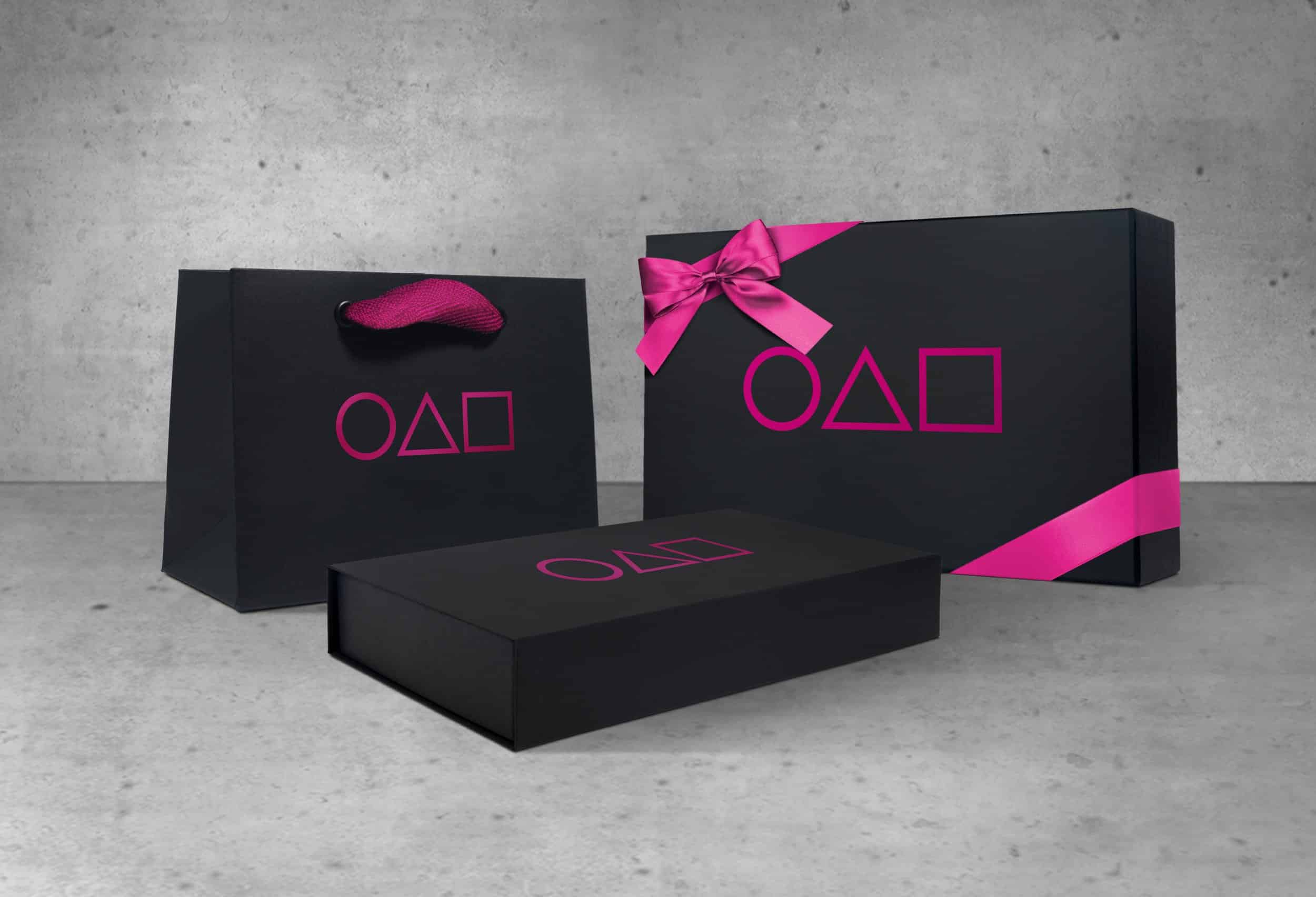
One of Squid Game’s most recognizable elements? The trio of shapes: ● ▲ ■.
No words. No branding. Just three simple symbols—and yet they instantly evoke the show, its themes, and its tone.
This proves a golden rule of packaging: symbols cut through noise faster than words.
How this applies to your brand:
- Create a brand icon that can live beside or instead of your logo.
- Use repeating motifs on your labels (ex: leaves for tea, mountains for coffee, waves for skincare).
- Think in shape language: Can the outline of your label, box, or sticker become recognizable on its own?
Packaging that uses bold, clear shapes is more recognizable from a distance, online, or on crowded shelves.
3. Minimalism, When Done Right, Is Unforgettable
The mysterious Squid Game invitation—a simple kraft card with three black shapes—became instantly viral because it was so minimal it felt loaded with meaning.
It wasn’t cluttered with text or imagery. It created intrigue with less, not more.
Packaging brands can take note:
- Minimal designs often signal luxury or exclusivity.
- Sparse designs create mystery, drawing the customer in.
- A calm, clean layout gives your product a premium feel.
�� For custom candle packaging, this can mean:
- A matte candle label with only the type of wax, fragrance, and logo.
- One bold accent color paired with cream or kraft.
- Symbols instead of words to suggest scent profiles or occasion for use.
In a world of visual overload, restraint can be your greatest asset.
4. Packaging Can Create Emotional Anticipation
Think about how Squid Game handled progression: each stage introduced a new room, new lighting, new rules—but the feeling of eerie suspense stayed consistent.
That same emotional momentum is what good packaging delivers during the unboxing experience. From the outer box to the wrapping to the label beneath, it’s a carefully constructed journey.
Brands should ask:
- How does my packaging build suspense or curiosity?
- Does my label design feel like a reveal?
- Is there a tactile or structural element that slows the unboxing, increasing anticipation?
For instance:
- A custom coffee bag with a resealable wax seal and hidden tasting notes
- A tea canister with a pop-top that reveals a hand-inked message inside
- A luxury label that peels back to expose a different design underneath
Packaging that delivers an emotional sequence doesn’t just impress—it sticks.
5. Color Palettes Trigger Memory
Squid Game mastered color psychology. The muted green tracksuits made players feel anonymous. The pink guards signaled danger and authority. The pastel playroom-style architecture contrasted violently with the deadly games.
Color = Mood = Memory.
For packaging, your color choices need to be deliberate:
- Earthy tones suggest organic, authentic, sustainable.
- Pastels feel approachable, playful, and modern.
- Jewel tones suggest luxury, depth, and tradition.
- Monochrome or black/white palettes imply minimalism and prestige.
If you’re selling premium blends, custom tea labels in rich forest greens or midnight blues can feel calming and indulgent. For bold espresso roasts, custom coffee labels with deep reds or burnt orange tones suggest energy and flavor.
Whatever palette you choose—own it. Let your brand be recognized by color alone.
6. Cultural Relevance Increases Virality
Squid Game became a global hit not just because it was thrilling—but because it reflected real-world class tension, economic anxiety, and social hierarchy in ways people could feel.
Likewise, packaging that aligns with current cultural sentiments gains traction:
- Eco-friendly materials signal sustainability.
- Locally sourced elements signal support for community.
- Bilingual or multicultural labels show inclusivity.
- Retro fonts or storytelling taps into nostalgia.
Being culturally aware makes your packaging feel tapped in, and people want to buy what aligns with their values.
7. Design Elements Can Go Beyond the Product
Just like how Squid Game’s visual identity became memes, costumes, and Halloween decorations, your packaging aesthetic can extend beyond the item.
Ask yourself:
- Can your brand colors become Instagram backgrounds?
- Can your labels become collectibles or stickers?
- Can your tea or coffee tin double as a desk decor piece?
Packaging that inspires reuse, display, or sharing on social media gives your brand life outside the sale.
Final Takeaway: Design for Icon Status
Squid Game didn’t need loud branding to become iconic. It used visual unity, emotional storytelling, and unforgettable symbols to sear itself into pop culture.
Your packaging can do the same.
Whether you’re designing custom coffee labels, launching limited-edition tea tins, or refreshing your entire visual identity, think beyond function.
Because the true power of packaging lies in what it makes people feel—and remember.